Events/Campaigns - Irish Open & Vet5K
Context
St. Patrick Center’s two largest fundraisers were held back by dated, generic visual identities. The use of flat colors and stock iconography failed to reflect the prestige of the Irish Open or the community energy of the Vet5K, making the events feel "routine" rather than "essential."
The Goal: Modernize both identities to better engage their specific target audiences: wealthy donors for the Irish Open and community advocates for the Vet5K, while maintaining a link to the Catholic Charities parent brand.
Discovery
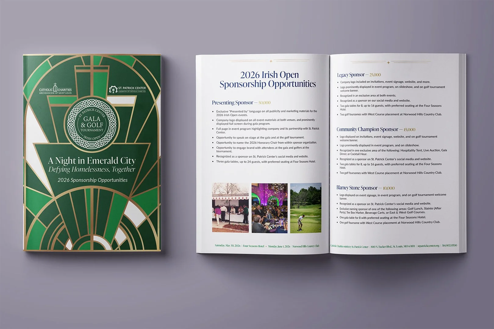
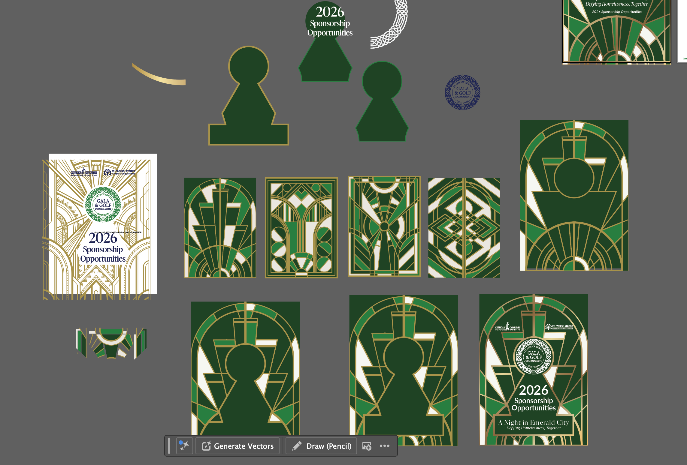
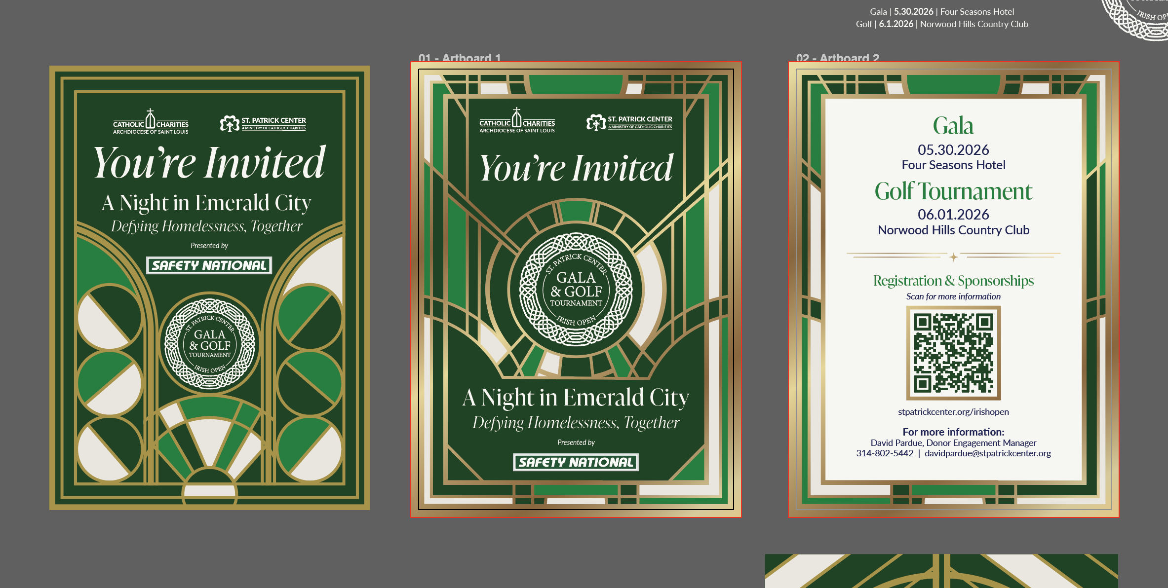
Insights: I discovered that the "Irish" theme for the Open was leaning into clichés. To elevate it, I looked toward St. Louis’s architectural history, specifically the World’s Fair and the Cathedral Basilica, to create a more "prestige-local" identity.
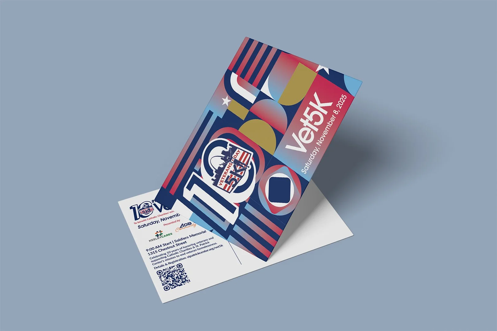
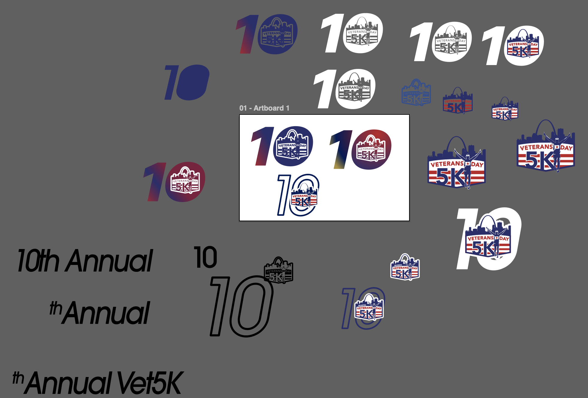
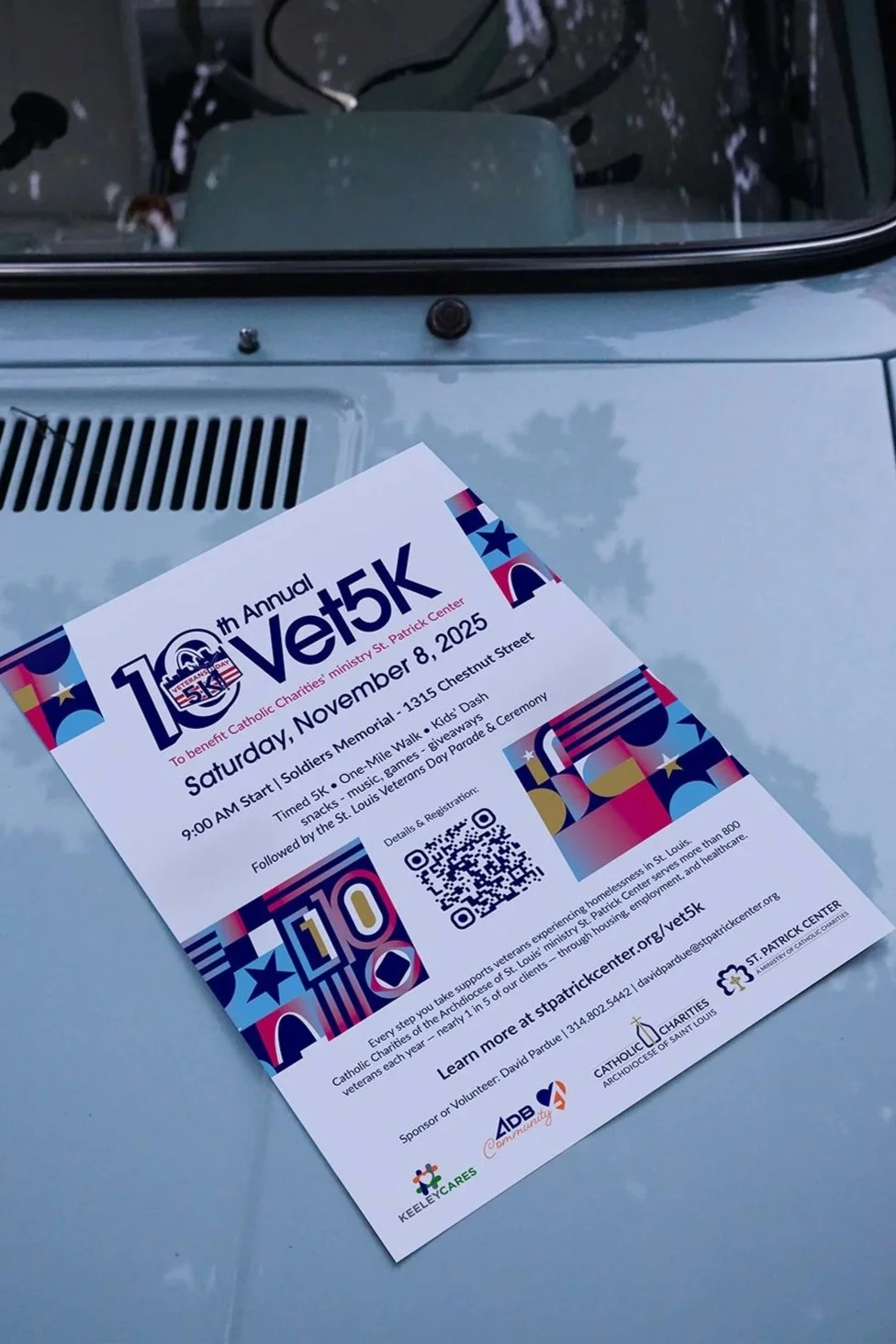
Pivot: For the Vet5K, we realized that as the 10th anniversary, the brand needed to transition to a more recognizable local race. I moved away from static iconography toward dynamic, sheered typography that implies movement and momentum.

Execution
I developed two distinct geometric design systems.
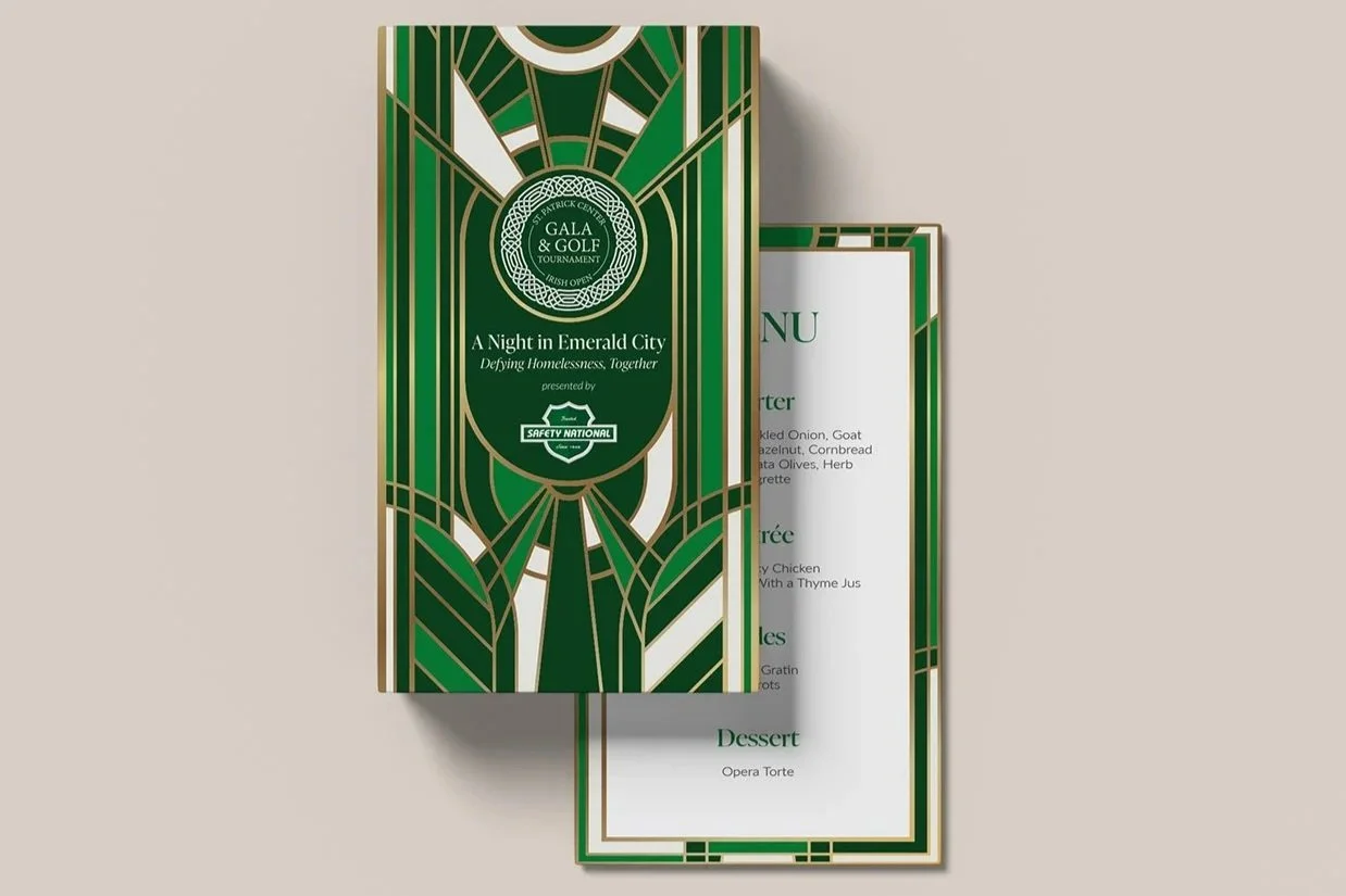
The Irish Open: Focused on custom Art Deco-inspired patterns and a highly expressive, elegant typeface. I refreshed the palette with deep greens and gold accents to signal high-tier philanthropy.
The Vet5K: Created a system of bold gradients and stars-and-stripes motifs integrated with the St. Louis Arch. I inserted "10s" into the geometry to celebrate the milestone year.
Rationale: Both systems maintained the Navy Blue and "Lato" font from the Catholic Charities brand guide to ensure organizational cohesion. I prioritized information hierarchy in all print materials, ensuring sponsorship tiers and event schedules were scannable and user-friendly.
Collaboration: I worked with the philanthropy team to ensure the Sponsorship Packets weren't just informative but felt like "premium" invites, leading to better conversion.
Outcome
I successfully modernized the visual identity for the organization’s two primary fundraising streams, leading to a more professionalized presentation for high-tier corporate sponsors.
Deliverables: I personally executed the full production pipeline for both events, delivering a complete suite of cross-channel assets:
Print & Environmental: Designed and prepared all high-stakes print materials, including premium sponsorship packets, save the date/invitations, large-format event banners, and day-of way-finding signage.
Digital & Social: Spearheaded the digital rollout, creating optimized social media marketing kits, landing pages, and email campaign assets to drive registration and sponsor visibility.
Technical Production: Managed all pre-press specifications and coordinated directly with local vendors to ensure color accuracy and quality control across diverse physical mediums.
Reflection
Lessons: This project taught me that user experience (UX) is also for physical event collateral. By cleaning up the typography and hierarchy on course signage and packets, I made it easier for participants to find what they need.
Next Steps: I would next look to integrate more data-driven touchpoints into the physical assets, such as tailored QR codes to track real-time sponsor engagement during the gala and race.