Context
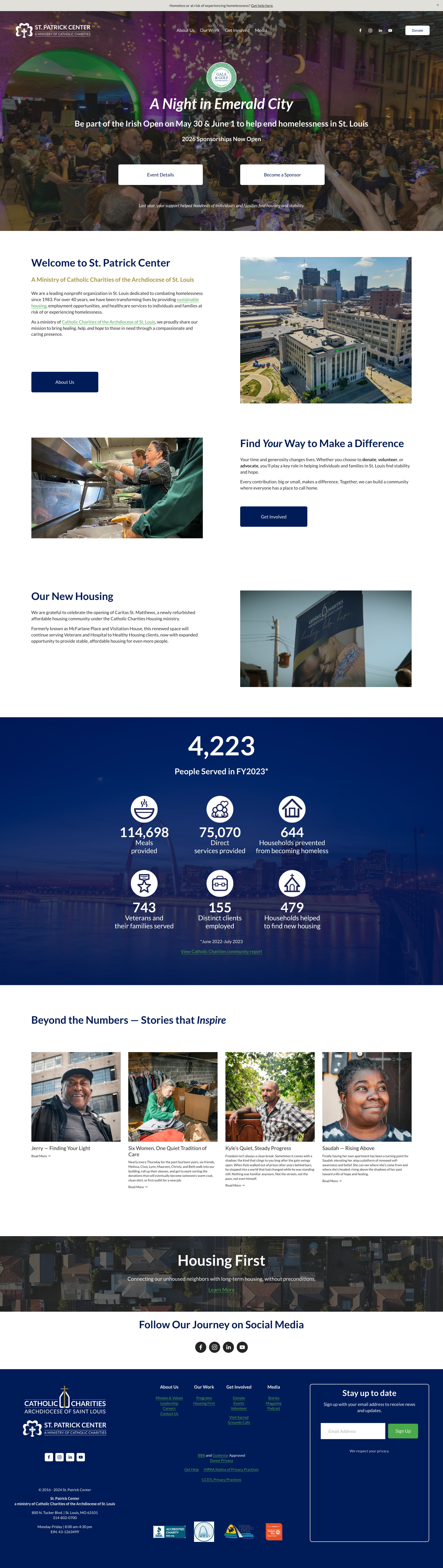
The existing digital presence was visually dated and lacked critical information about specific programs. Navigation was a major "friction point"—essential paths for volunteers, in-kind donors, and individuals seeking help were buried or non-existent.
Goal: Modernize the digital experience to drive supporter engagement and provide a clear, accessible path for clients to find intake information.
Discovery (The Research)
Insights: Data showed a 50/50 split between mobile and desktop users, making "mobile-first" responsiveness a non-negotiable requirement. Through stakeholder surveys and user journey mapping, we discovered that users were struggling to find the "Get Help" information due to poor information architecture.
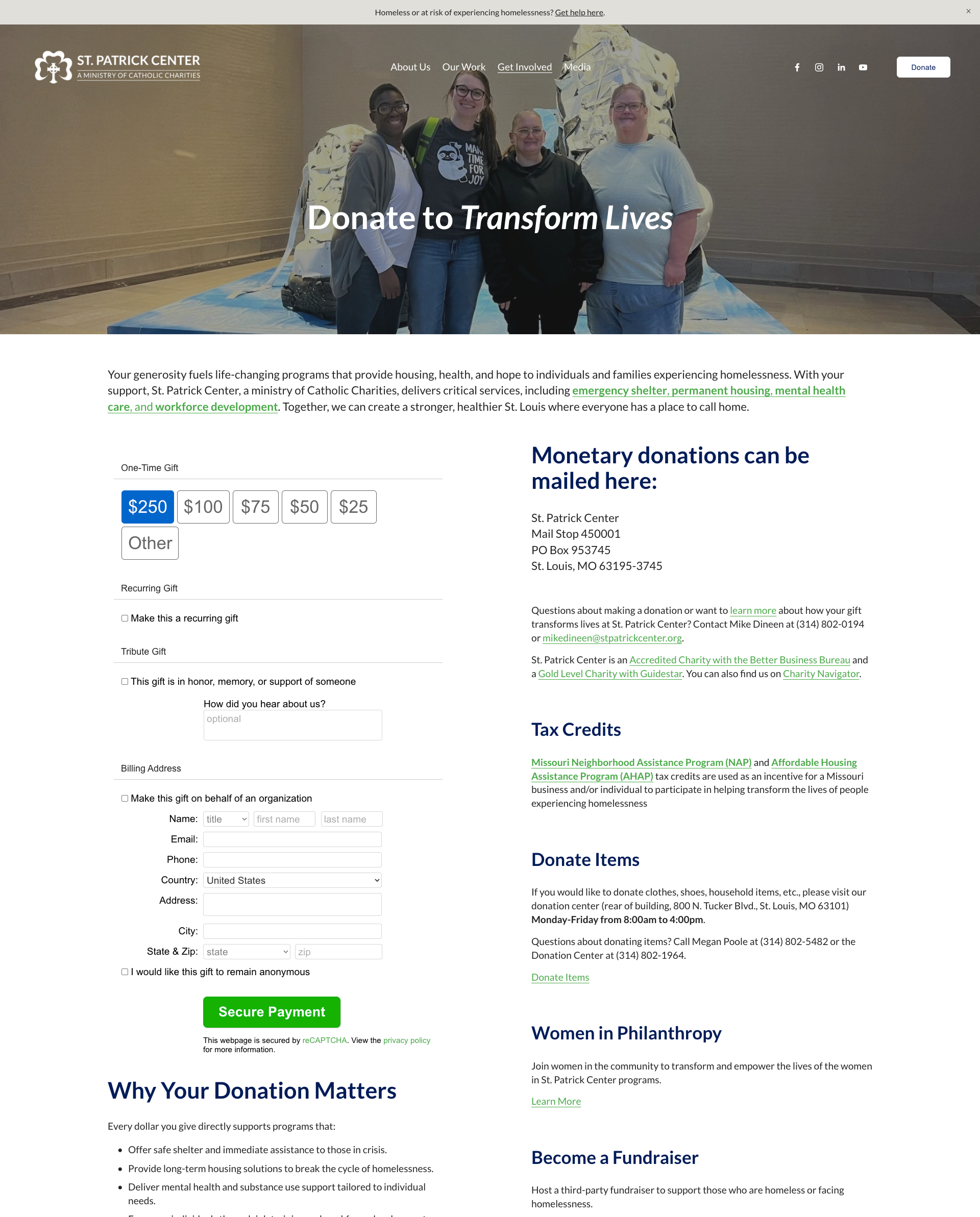
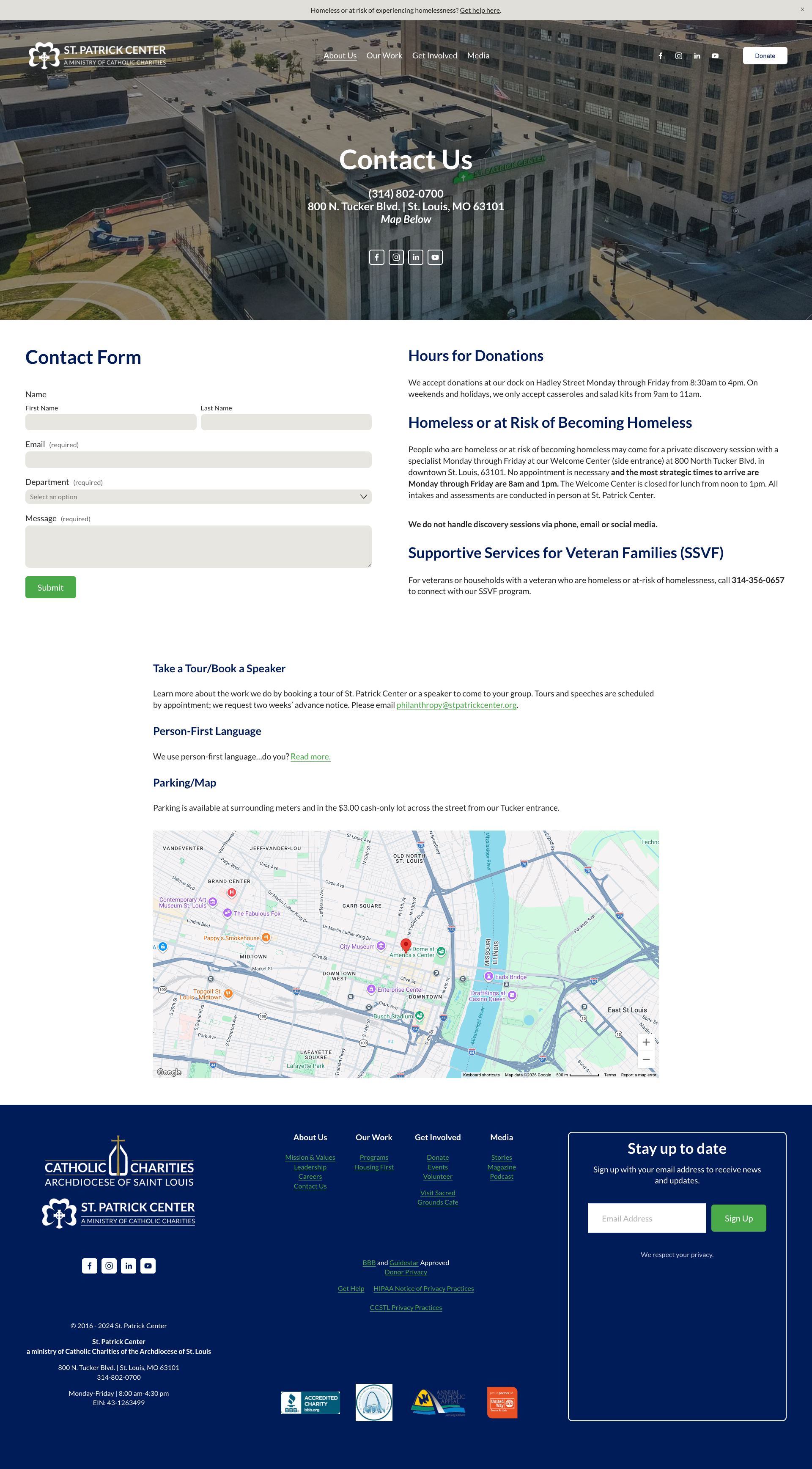
Pivot: We realized the site needed to serve two masters: the wealthy advocate and the person on the street. I pivoted the layout to prioritize "Supporter/Advocate" content on the main pages while creating a highly accessible, persistent banner at the top of the site dedicated exclusively to immediate intake information.
Execution
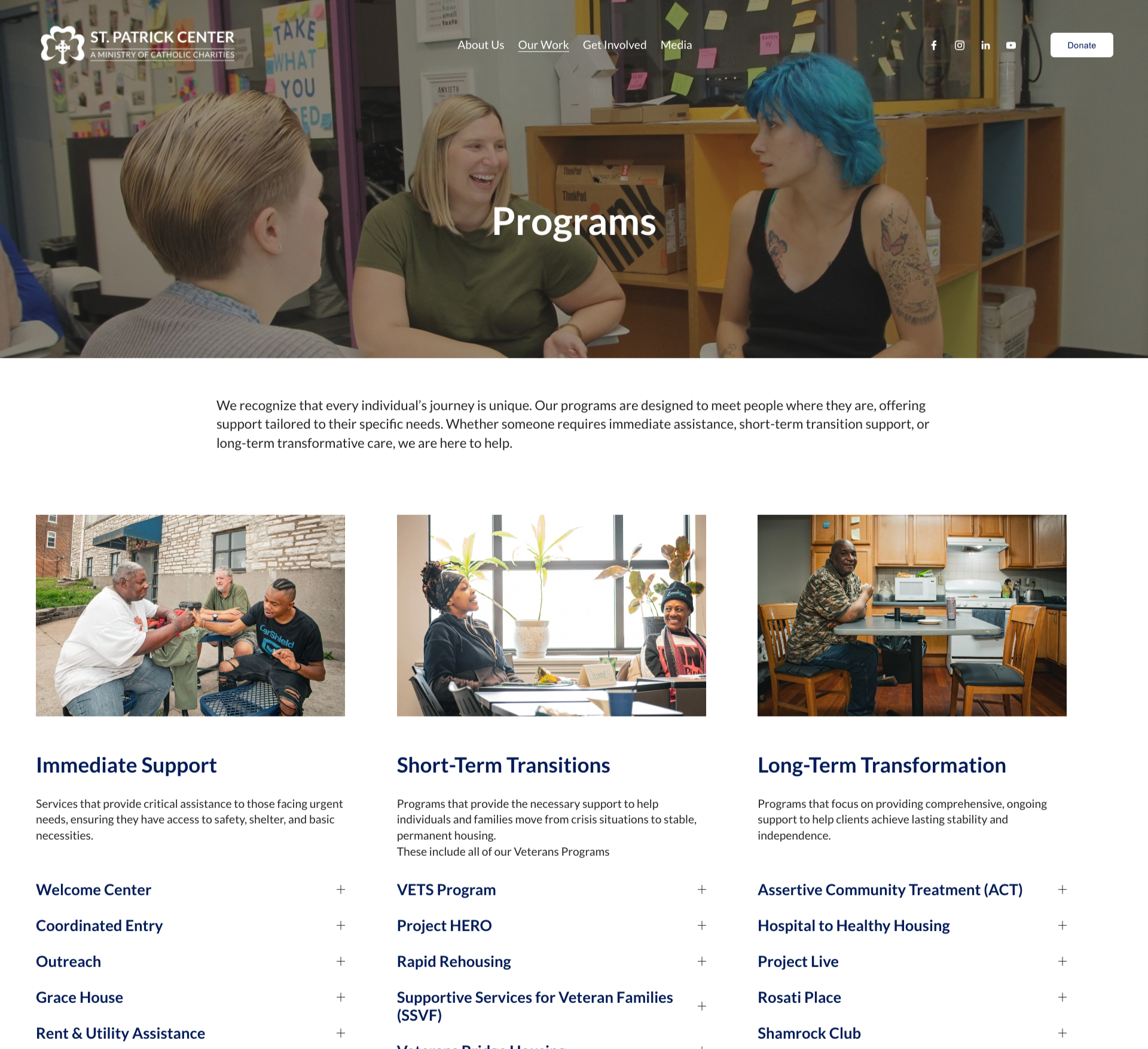
I completely reorganized the global navigation, grouping content into clear, action-oriented categories.
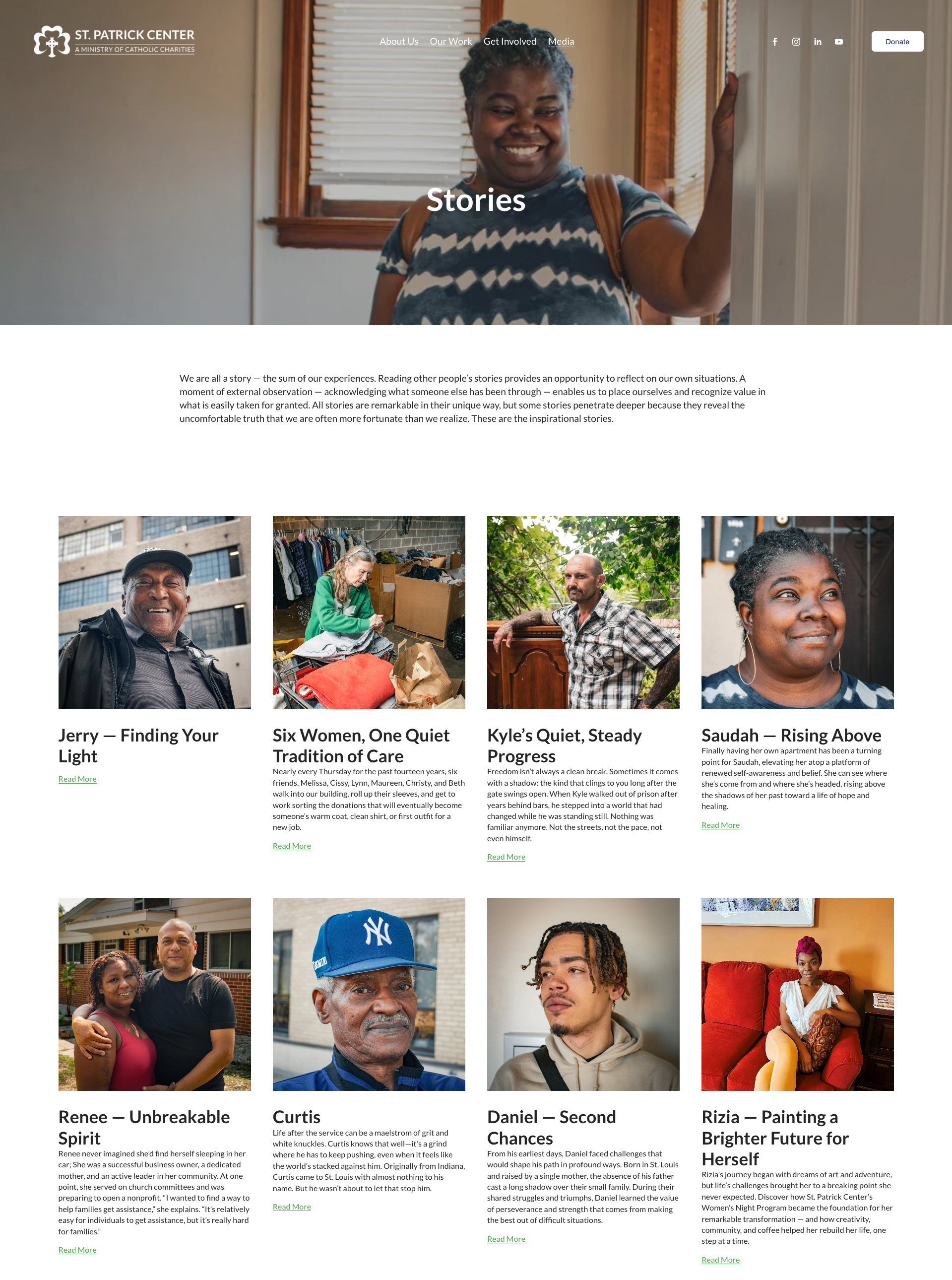
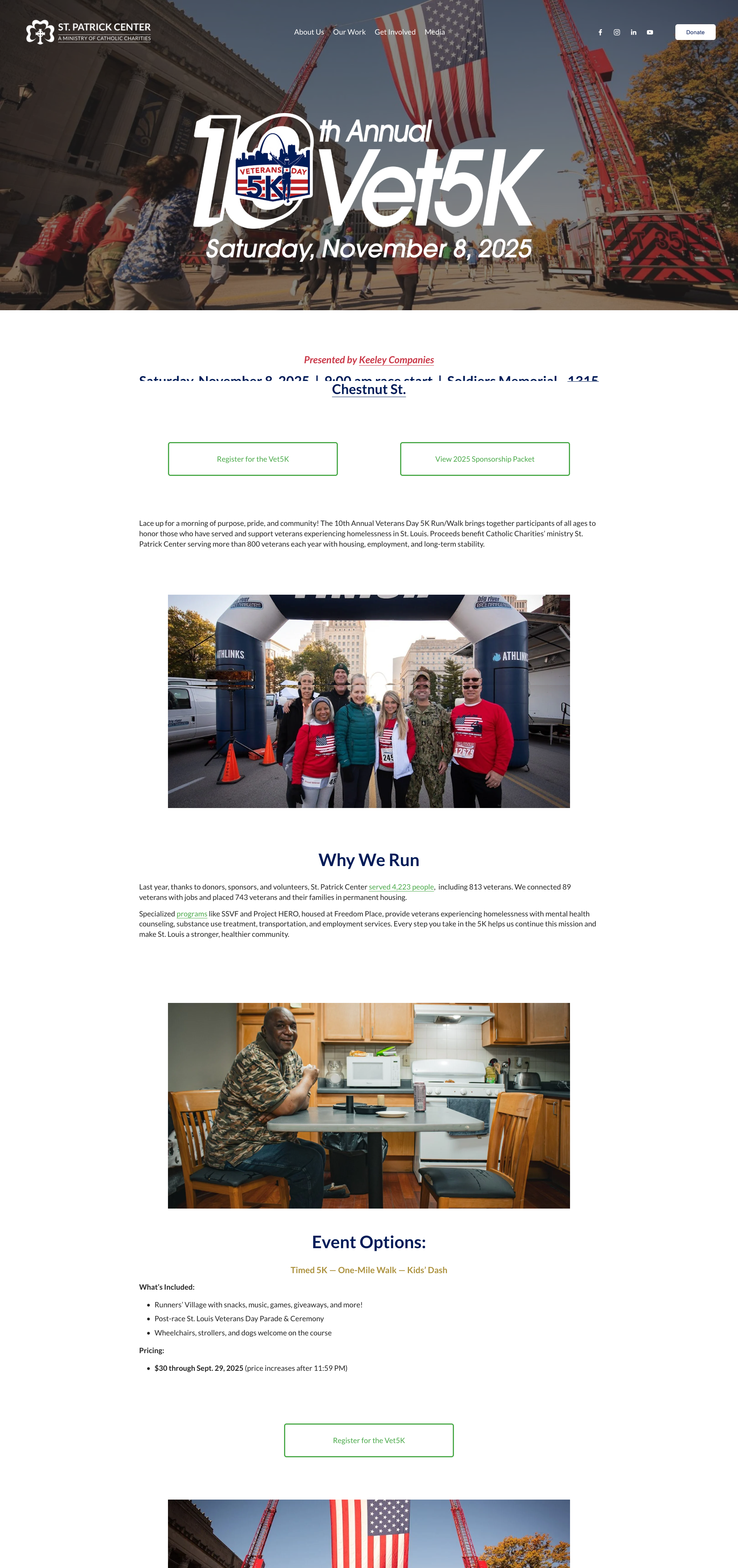
Rationale: I implemented a "Sticky" donate button on every page to minimize friction for donors. To fix the "dated" feel, I replaced all stock imagery with a custom library of original, on-site photography to build immediate trust.
The Technical Strategy: I overhauled the backend SEO, targeting specific local keywords, optimizing alt-descriptions for accessibility, and improving crawl depth to ensure the organization ranked high for St. Louis-based social services.
Outcome
Metrics: Achieved a 12% increase in new site visitors through improved search visibility. More importantly, we recorded higher engagement rates on the "Donate" and "Volunteer" pages, proving a more efficient user path.
Deliverable: A fully responsive, SEO-optimized Squarespace site.
Reflection
Lessons: Designing for a 50/50 mobile-desktop split taught me how to maintain visual impact without sacrificing load times or readability for users who may have limited data or older devices.
Next Steps: My goal is to transform the site from a "brochure" into a comprehensive community resource hub. I plan to build out dedicated landing pages featuring destigmatization facts, immediate self-help steps for unhoused individuals, and a directory of partner providers. Strategically, I want to optimize these resources for ai overviews by targeting conversational, long-tail keywords, ensuring that when people ask complex questions about homelessness in St. Louis, St. Patrick Center is the first answer they receive.