events/Campaigns - Beer Mile North American Classic
Context
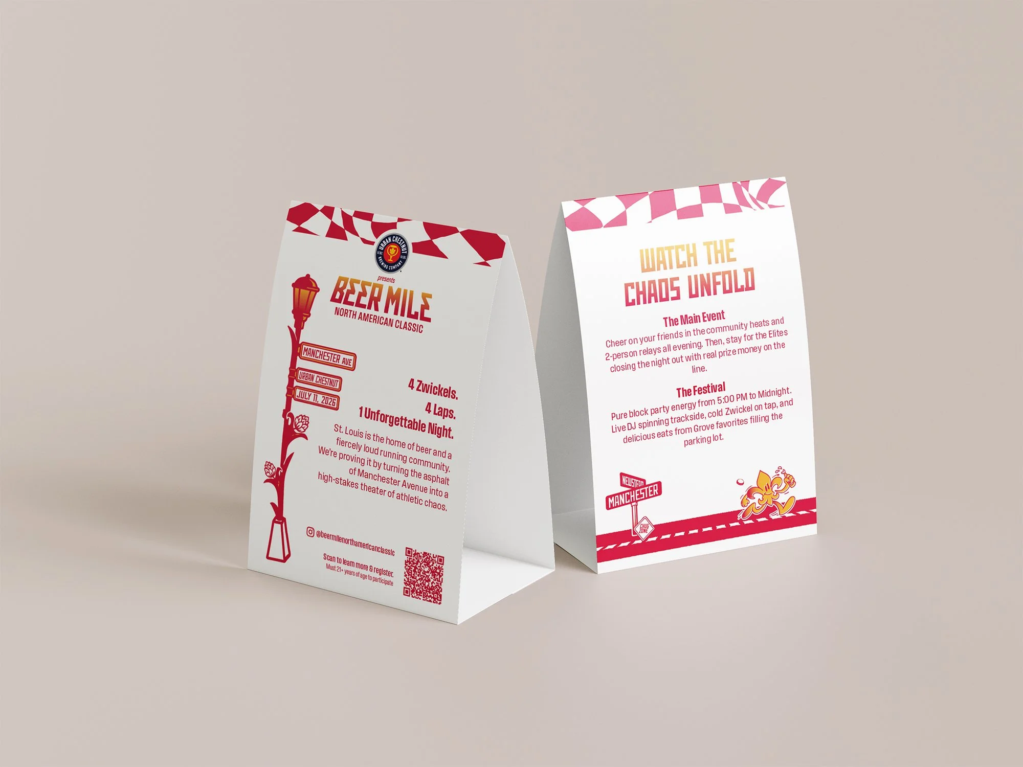
As a brand-new, inaugural event, the Beer Mile North American Classic had to solve a dual challenge: validating itself as a professional qualifying event for the World Classic while also feeling like an approachable, high-energy neighborhood festival in The Grove.
Goal: Establish a professional, fun, and energetic brand identity that attracted three distinct groups: elite national runners, the local St. Louis running community, and neighborhood patrons of the Grove.

Discovery
Insights: Research focused on the intersection of "brewery culture" and "elite competition." I discovered that traditional beer miles are often viewed as grassroots or "low-key" backyard events. To succeed, we had to elevate the visual authority to match its status as a World Classic qualifier.
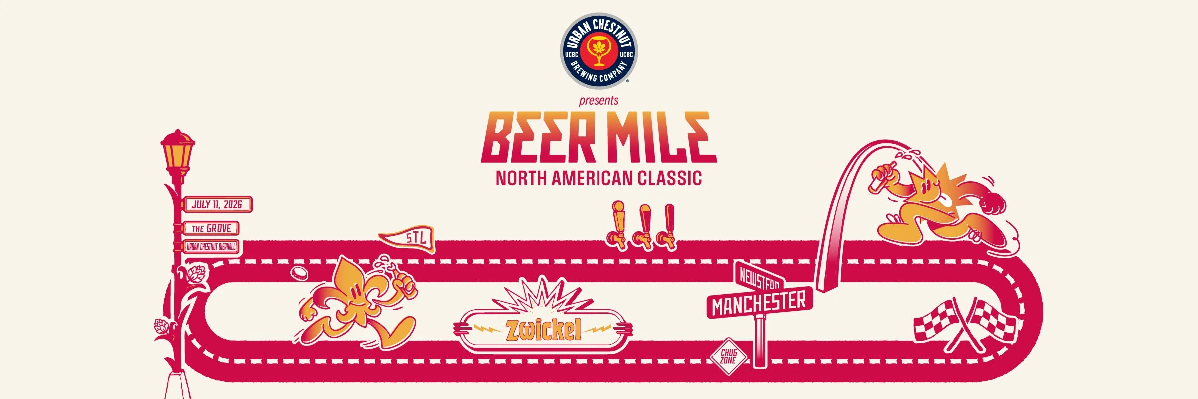
Pivot: Early feedback showed that people were confused about the venue, assuming it was on a traditional track. I shifted the creative strategy to lean heavily into "Urban Grittiness," emphasizing the street-level nature of the course on Manchester Road to clearly communicate it was a road race, not a track race.
Execution
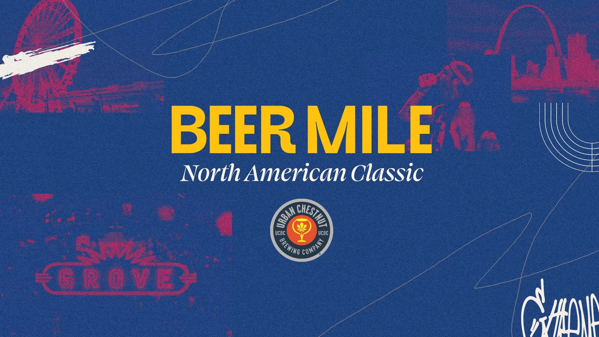
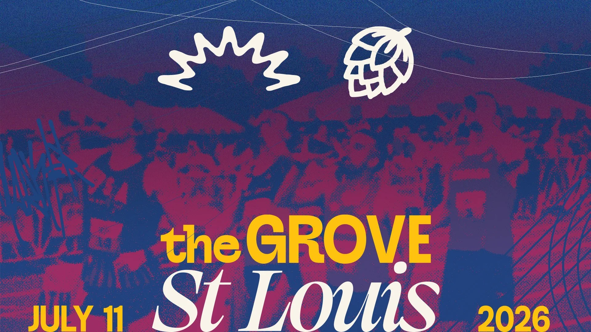
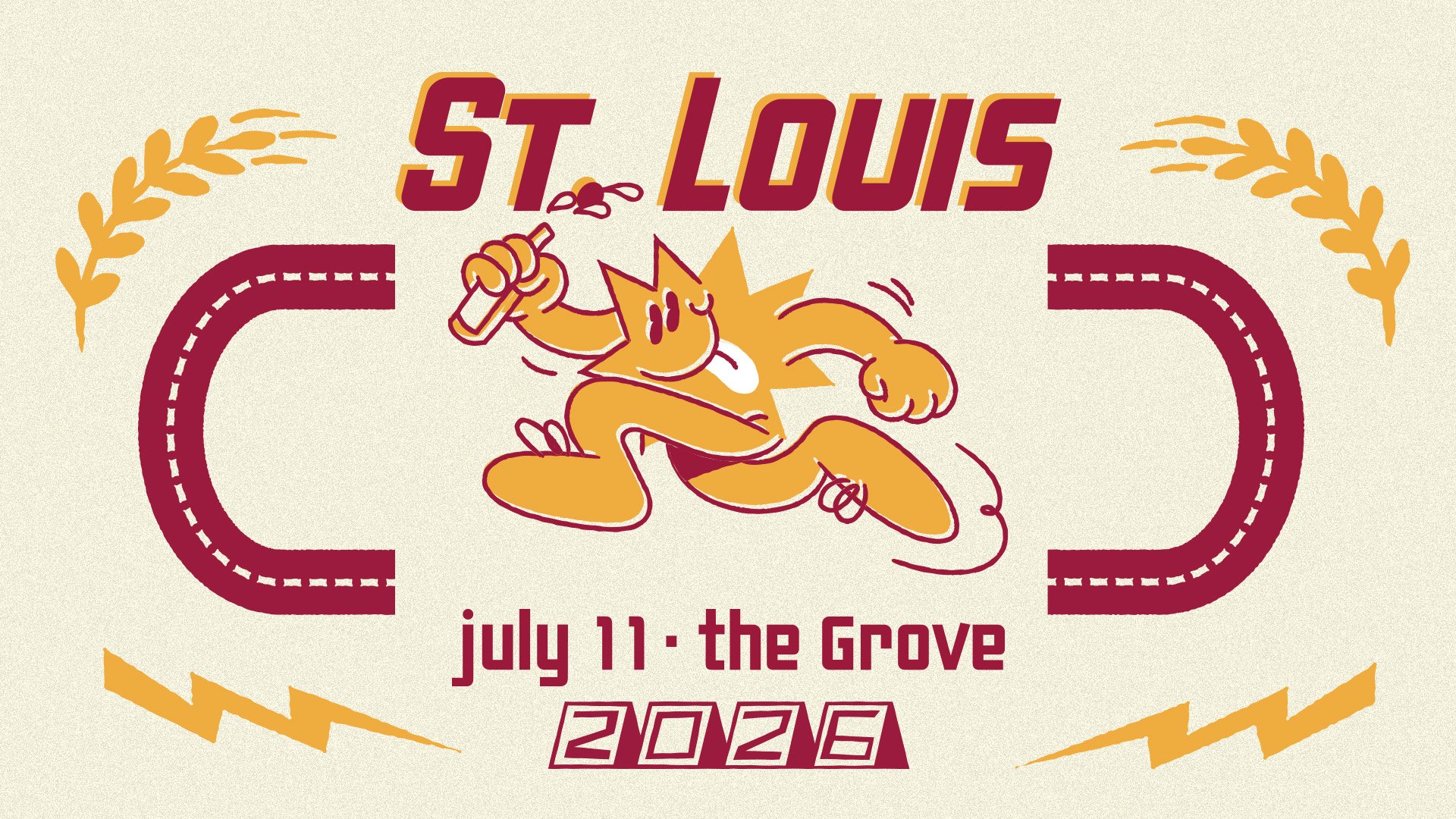
Iterations: I initially explored heavy "St. Louis" imagery with scratches and graffiti to reflect the urban vibe of The Grove.
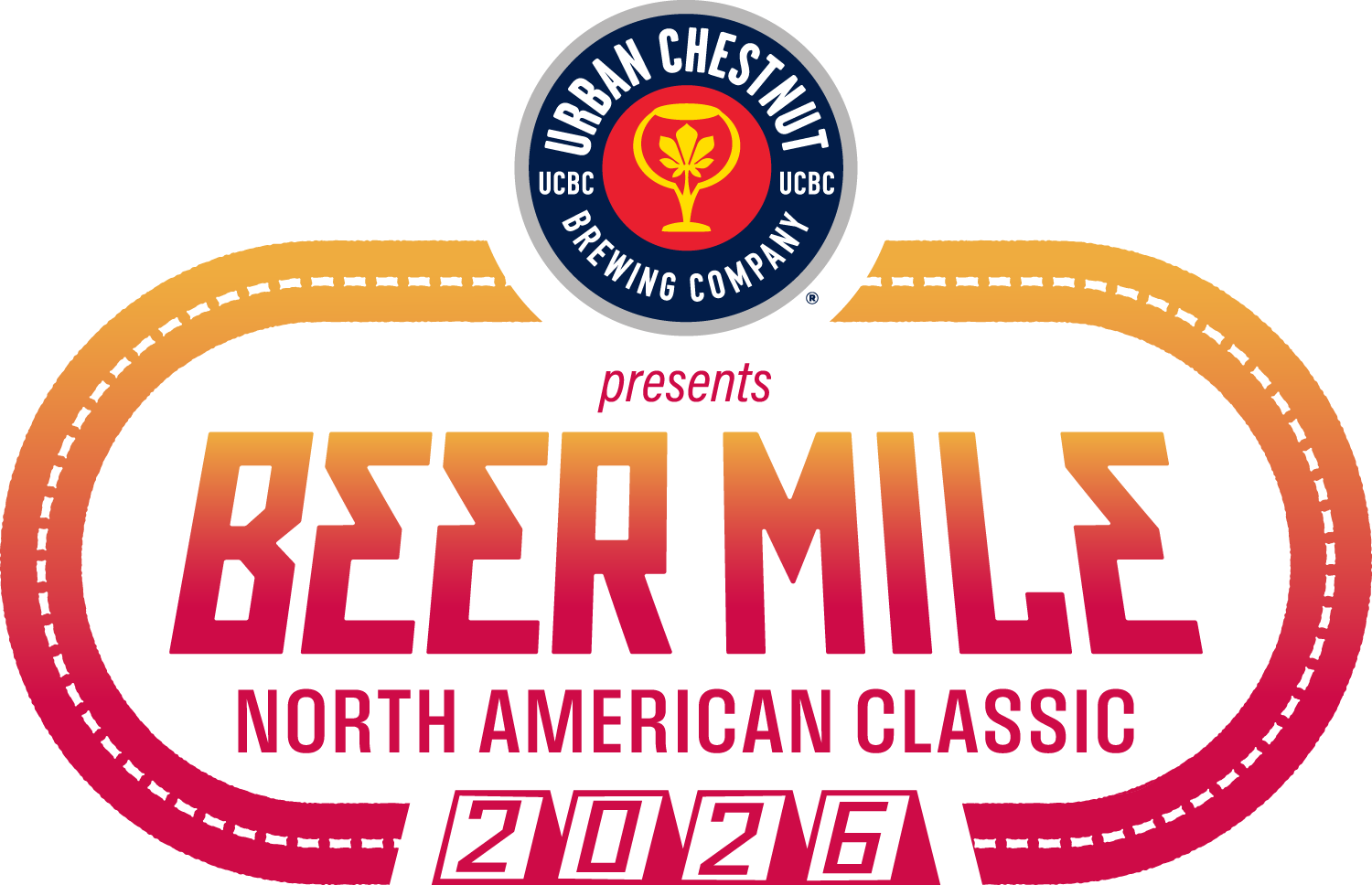
Rationale: We ultimately chose a bold, custom wordmark with recognizable typography over a singular icon. This allowed the brand to live harmoniously next to the iconic UCBC branding while still having enough unique "personality" to stand out on its own.
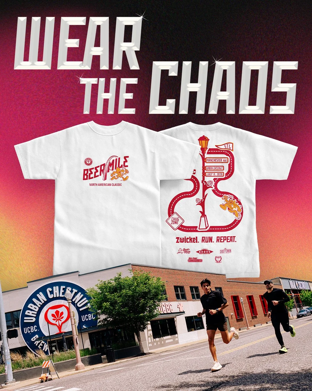
Collaboration: I worked directly with Urban Chestnut to ensure the illustrative style supported their flagship beer, Zwickel. Additionally, a colleague and I coordinated with local St. Louis screen-printing shops to translate these custom illustrations onto high-quality merch, ensuring the "hand-drawn" feel was preserved in the physical product.


Outcome (The Result)
I successfully established the inaugural identity for a national qualifying and community event. The professionalized branding led to high registration numbers among both elite and local runners and solidified a successful partnership with UCBC.
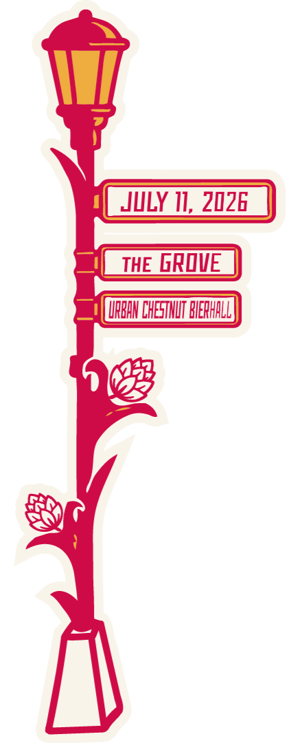
Deliverables: A complete event identity system including custom typography, mascot illustrations, social media marketing kits, and a full line of event-day merchandise.


Reflection
Lessons: I learned how to manage a brand that has to work well with various stakeholders and not based on my personal preferences. Designing a new identity that must sit alongside an established brand like Urban Chestnut taught me how to find the visual middle ground, respecting a partner’s legacy while still creating something fresh and distinct.
Next Steps: For future iterations, I would love to expand the illustrations further and experiment with more typography, creating a unique annual collectible aspect to the merch to drive repeat attendance.